Preamble
The data analysis process is a series of steps that are used to organize, clean, and analyze data. The process is used to extract useful information from the data and to make decisions based on the data. The process is used in a variety of fields, including business, science, and engineering. The process is typically broken down into several steps, including data collection, data cleaning, data analysis, and data visualization.

The scope of this notebook is to provide a brief introduction to the data analysis process using the Python programming language and the Pandas library (https://
For data manipulation, we make the choice to work with Pandas; other libraries like NumPy, SciPy, and Scikit-learn are also commonly used for data analysis.
Objectives
in this notebook, we will cover the following topics:
Data Laoding
Data Manipulation
Data Visualization
Data Analysis / data modeling
We will use as example data set a list of students with their grades in different tests.
Source
# Setup
import numpy as np
import pandas as pd
import matplotlib.pyplot as plt
import matplotlib as mpl
First of all, let’s have a look at the data set
For that you need to open the data set in is native format, in this case a csv file. csv files are text files that store data in a tabular format, with each row representing a record and each column representing a field. Therefore, you can open the file with a text editor or a spreadsheet software like Excel.
Data Loading and basic manipulation
Load data and create a data frame from csv file
More explanation can be found here : https://
df = pd.read_csv("./_DATA/Note_csv.csv", delimiter=";")
dfDisplay the dataframe
# return the beginning of the dataframe
df = df.fillna(0.0)
df.head(10)# return the end of the dataframe
df.tail(10)Selecting data in a dataframe
# get data from index 2
df.loc[2]
section MM
TD C
name lola
ET 9.5
CC 13.25
Name: 2, dtype: object# get name from index 2
df.name[2]'lola'# Sliccing is also working
df.name[2:6]2 lola
3 irma
4 florence
5 vi
Name: name, dtype: objectGet one of row of the dataframe
df.TD0 A
1 A
2 C
3 B
4 D
..
90 A
91 D
92 A
93 D
94 B
Name: TD, Length: 95, dtype: objectdf.TD.value_counts()TD
B 25
A 24
C 23
D 23
Name: count, dtype: int64Get the proportion of students between groups
df.TD.value_counts(normalize=True)TD
B 0.263158
A 0.252632
C 0.242105
D 0.242105
Name: proportion, dtype: float64Display the proportion of students between groups
Using the plot function of panda:
visualization option of pandas can be found here : http://
fig = plt.figure()
df.TD.value_counts(normalize=True).plot.pie(
    labels=["A", "B", "C", "D"], colors=["r", "g", "b", "y"], autopct="%.1f"
)
plt.show()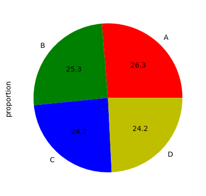
Using the plot function of matplotlib:
val = df.TD.value_counts(normalize=True).values
explode = (0.5, 0, 0.2, 0)
labels = "A", "B", "C", "D"
fig1, ax1 = plt.subplots()
ax1.pie(
    val, explode=explode, labels=labels, autopct="%1.1f%%", shadow=True, startangle=90
)
ax1.axis("equal")  # Equal aspect ratio ensures that pie is drawn as a circle.

plt.show()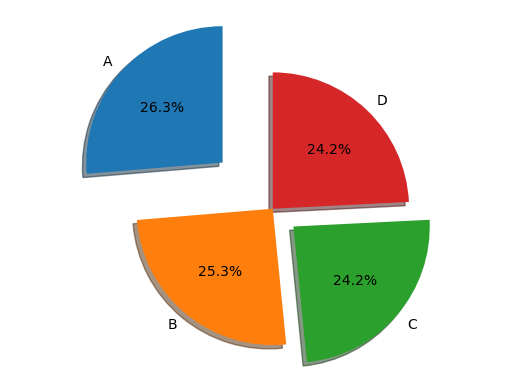
Get student list who get a grad higher than 14/20 on both ET and CC
df[(df.ET > 14.0) & (df.CC > 14.0)]df.ET.mean()np.float64(10.810526315789474)The mean of ET over students from B group
df.ET[df.TD == "B"].mean()np.float64(9.72)Statistical description of the data by TD using the ‘groupby()’ function
df.groupby(["TD"]).describe() # compte the mean of each note for each groupeDisplay the grads with a histogram plot
# CC notes
fig = plt.figure()
df.CC.plot.hist(alpha=0.5, bins=np.arange(1, 20))
plt.show()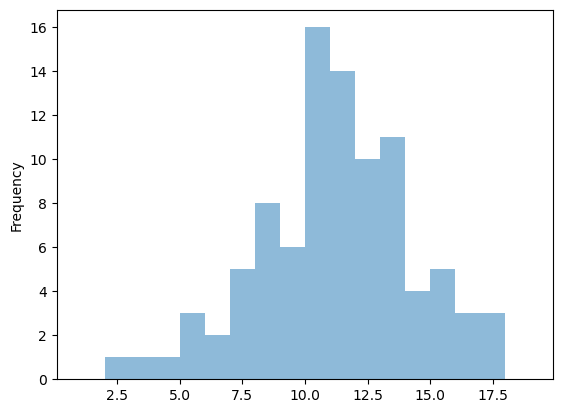
# ET notes
fig = plt.figure()
df.ET.plot.hist(alpha=0.5, bins=np.arange(1, 20))
plt.show()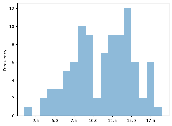
fig = plt.figure()
df.plot.hist(alpha=0.5, bins=np.arange(1, 20))
plt.show()
<Figure size 640x480 with 0 Axes>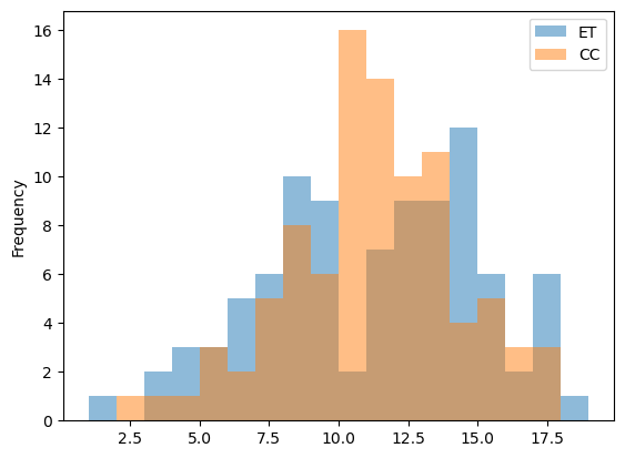
Let’s compute the mean of both grads
We need first to add a new row to a data frame
df["FinalNote"] = 0.0  # add  row filled with 0.0
dfdf.head()Let’s compute the mean
df["FinalNote"] = 0.7 * df.ET + 0.3 * df.CC
# the axis option alows comptuting the mean over lines or rowsdf.head()fig = plt.figure()
df.FinalNote.plot.hist(alpha=0.5, bins=np.arange(1, 20))
plt.show()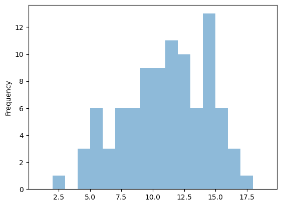
What is the overall mean ?
df.FinalNote.mean()np.float64(10.80657894736842)